
Nation Station - beirut
Located in Beirut, Lebanon, @nationstation__ stands as a symbol of resilience, togetherness, and inclusivity. It is a community kitchen housed in a once-abandoned gas station, renovated after the tragic blast to feed residents in need. Today, Nation Station provides support and nourishment to the community, fostering a spirit of unity and collaboration among all residents.

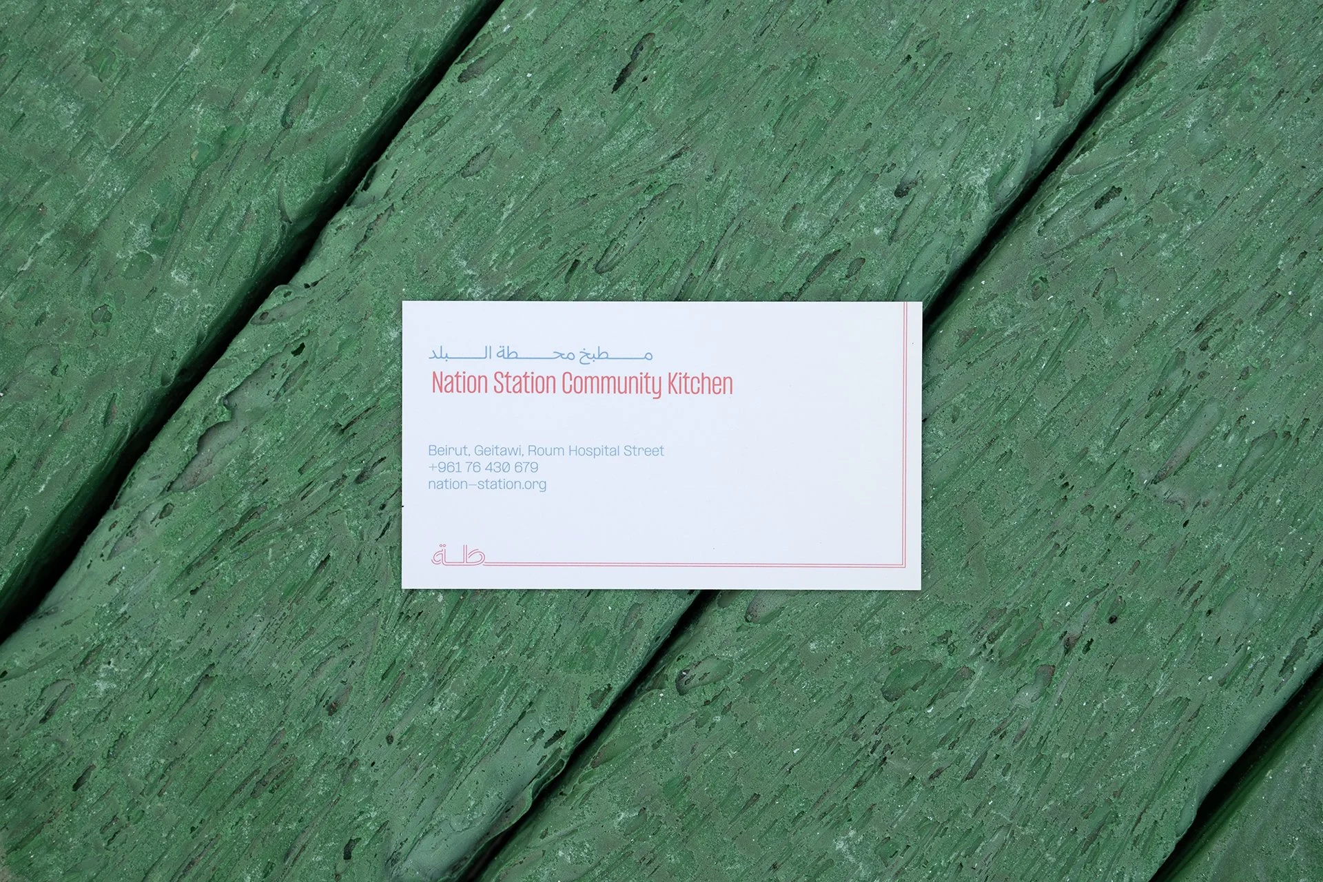


The branding embodies these core values through the use of local Arabic elements. By incorporating the kashida - an elongation of characters - along with a “local” typeface - Inline Arabic, a sense of unity and inclusivity is ensured. These graphic choices reflect the openness and collaborative spirit that defines Nation Station, making it a welcoming space for all.
Photography // Kassim Dabaji @kassimdabaji
Logotype // Inline Arabic by Tarek Atrissi @atrissi @arabic_typography
Typography // Formula by @pangram.pangram Gawhar by @hehehtype